Best Practices for Designing User-Friendly Menus and Submenus
Menus are a crucial component of website and application design. They help users navigate and locate information efficiently. A well-designed menu and submenu should be responsive across all devices and accessible to everyone. This article summarizes key guidelines for designing effective menus to ensure the best user experience.
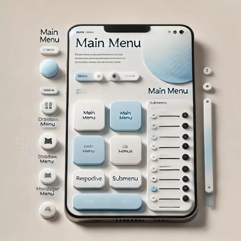
1. Key Principles of a Good Menu
1.1 Quick Response
Menus should display and respond immediately to user interactions, such as clicks or mouse hovers, to ensure a smooth experience.
1.2 Ease of Use
- Menus should have clear structures, with the hierarchy of main and submenus well-organized.
- Buttons and clickable areas should be large enough for touch devices.
1.3 Accessibility
Menus should accommodate all users, including those with physical limitations or assistive devices like keyboards or screen readers.
2. Types of Submenu Expansions
2.1 Expansion on Click
- Suitable for mobile devices such as smartphones and tablets.
- Reduces accidental menu openings.
- Provides clear control over menu display.
2.2 Expansion on Hover
- Ideal for desktop usage with a mouse.
- Increases speed and convenience for navigation.
2.3 Conditional Expansion
- Use "click" on mobile and "hover" on desktop.
- Allow users to click on arrow icons to open submenus, avoiding confusion with main menu links.
3. Responsive Menu Design
- Mobile and Tablet Use a hamburger menu or fullscreen menu to save space and improve usability.
- Desktop Use hover or click to expand menus for quick navigation.
4. ARIA and Accessibility
- Use
aria-expandedto indicate the open/close state of submenus. - Apply
aria-haspopupandaria-controlsto signal that a menu item has a submenu and specify its controls. - Support keyboard navigation with
Taband arrow keys (Arrow Down/Up).
5. Menu Code Examples
HTML Structure
<nav>

  <ul>

    <li>

      <button aria-expanded="false" aria-controls="submenu1">

        Main Menu

        <span aria-hidden="true">▼</span>

      </button>

      <ul id="submenu1" hidden>

        <li><a href="#">Submenu 1</a></li>

        <li><a href="#">Submenu 2</a></li>

      </ul>

    </li>

  </ul>

</nav>
JavaScript for Menu Interaction
document.querySelectorAll('button[aria-controls]').forEach(button => {

  button.addEventListener('click', () => {

    const expanded = button.getAttribute('aria-expanded') === 'true';

    button.setAttribute('aria-expanded', !expanded);

    document.getElementById(button.getAttribute('aria-controls')).hidden = expanded;

  });

});
CSS for Hover on Desktop
@media (min-width: 768px) {

  ul li:hover > ul {

    display: block;

  }

}
6. Submenu Design Guidelines
- Use clear HTML structures like
<ul>and<li>. - Design menus to suit the target audience, including appropriate colors, positions, and sizes.
- Use arrows or icons to indicate expandable submenus.
7. Conclusion
A good menu and submenu should be responsive, accessible, and easy to use. Whether you choose to expand menus with a click, hover, or conditional behavior, focus on creating a user-centric design. This ensures your website or application delivers a seamless and comfortable navigation experience.